_edited.jpg)

CSEMSC Brand Guide
In an Visual Communication Design class, we were tasked with creating an brand guide for the Central Shenandoah Emergency Medical Services Council. This project focused on highlighting their brand motifs of quality community service and support, while portraying a comforting and positive tone. We were tasked with including a location marker of the Shenandoah region and using the Virginia EMS and Health Services colors.
Project Steps
Brand Messaging
The CSEMSC provides connection and support to first responders in the Central Shenandoah region of Virginia. They assist in making sure there are protections and resources provided for each responder of their population.
With a tone of care and strength, the CSEMSC is vital to its region and therefore requires a eye-catching and memorable logo that will remind its viewers of the help they provide. They require a professional and established quality throughout their brand, securing trust in the brand and the Council as a whole.
Final Logo

This is the combination mark that should be used as the main logo. The logo includes the outline of the Central Shenandoah region, as well as the Star of Life in the middle. The positioning represents the connection and support that the CSEMSC provides for the entire region. The combination mark should be most frequently used wherever the main logo is used, however the image mark can be used when a smaller logo is needed. The company name should appear near this image if the combination mark is not used.
Logo Constraints
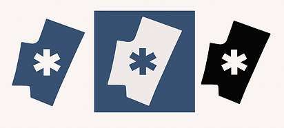
These are the image marks that should be used when the combination mark is not included. This shows an example of just the brand mark, then an inverted version meant for white surfaces, and then finally a black and white version to be used when necessary.

To maintain a consistent brand, the above combination marks should not be used.
This list is not every logo that is not allowed. In general, the entire logo should be clear and visible and the blue brand mark should never be used on a dark background.
Typeface
There will be two typefaces used throughout the brand that communicate a clean and simple message while being easy to read, even in small sizes.
The first will be Optima, used for headings and in the CSEMSC acronym part of the logo. The second font will be Avenir, used for the body text and any other formal business communications.

Colors
There will be five total colors that should be used throughout all the branding. Two of these are the primary colors, used in the logo, as well as any sort of merchandising. These colors should be the main colors in each logo, with the others as supporting colors when needed.
Both of these colors were chosen because of their relation to the region, signifying the Blue Ride Mountains, but also for their relation to the health world, including the Virginia Department of Health logo, which will be commonly paired with this new logo.
Primary

Secondary

Example Deliverables

Reflection
By building this brand from the ground up, I sharpened many of my design skills such as how to create a tone and feeling through colors and typography. I learned how to use Adobe Illustrator and InDesign to create an original logo, and how to input that logo onto deliverables. This project had many learning curves, however I am proud of what I was able to accomplish with it.